Challenge / Beginner Information Overload
It can be overwhelming to learn how to knit from scratch. A user experiences information overload by simply searching for help online, often requiring more research. Even trusted knitting resource sites yield thousands of results but no clear starting point.
Young professionals in DC need a way to access resources to learn how to knit an easy project because resources available are overwhelming and too technical.
Role: UX Designer Team of 1
(User Researcher + Visual Designer)
Research / Competitive Analysis
Discovering 2 Key Factors in Learning
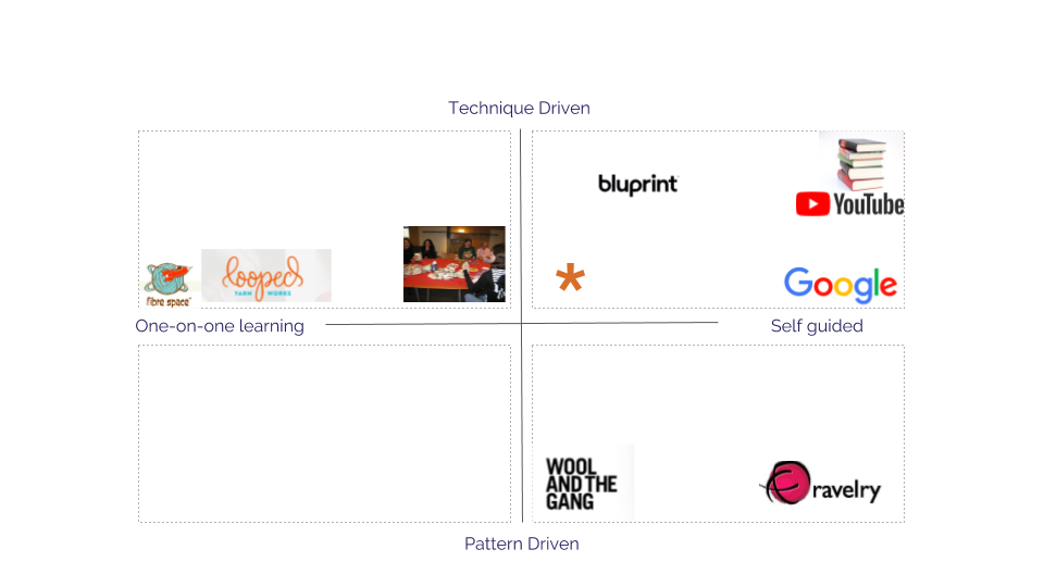
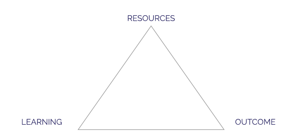
Competitive Analysis revealed that knitting instruction involved 2 factors in learning: 1) How users prefer to make; and 2) What environment users prefer.
MAKING
Technique (Process) / Pattern (Outcome)
ENVIRONMENT
One-on-one / Group / Self-guided
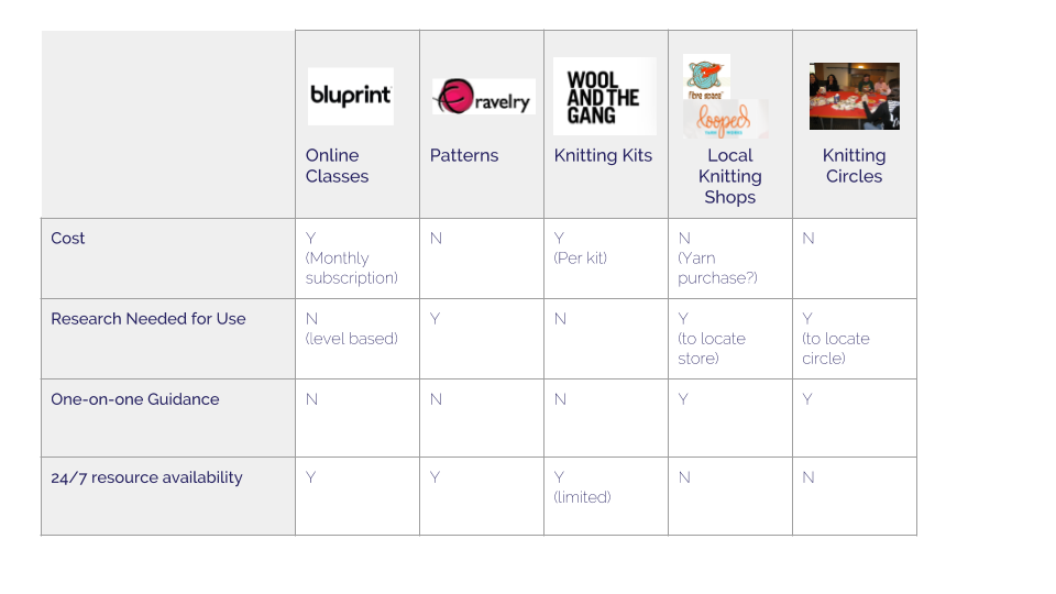
I conducted an in-depth competitive analysis to position the knitting navigator within the existing knitting community. I considered anything that would give users a possibility to learn how to knit a competitor (i.e. Google, YouTube, books) besides existing, dedicated online knitting resources.
A direct comparison of available knitting resources revealed that there is space for innovation and for a solution that provides: 24/7 availability; one-on-one guidance option; and a reduced need for extra research.
Research / Research Plan
Preparing for Interviews

Goal
Determining the ways the knitting learning experience can be improved and made more accessible for new users

Target Audience
Young professional women (20s and 30s) living in urban areas (specifically the DC area)

Research Areas
Experience with Knitting; Emotional Connection; Learning Resources; Hobby Habits; Hobbies - Emotional Connection
Research / The User
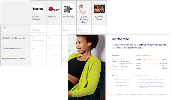
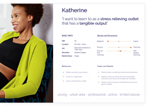
I want to learn to knit as a STRESS RELIEVING outlet that has a TANGIBLE OUTPUT
YOUNG 20s-30s
URBAN DC Area
PROFESSIONAL MA + Think Tank
ACTIVE Running
LIMITED LEISURE Rugby 3 hrs/night
I conducted 20 to 30 minute interviews with 4 users in the DC area ages 20-30 to gain insights into user motivation.
Knitting provides users…
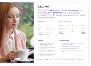
I identified two types of users based on their goals and engagement with learning:
While the Lauren persona explained certain segments of users who value process over product, I chose to focus on Katherine and the experience of a person who has never knitted before but has limited leisure time. Katherine prioritizes a finished product as part of her knitting experience.
This persona furthered refined findings from the comparative analysis to build a solution that took the following into account:
User Flow
Simplifying Learning
IA
Enhancing Clarity
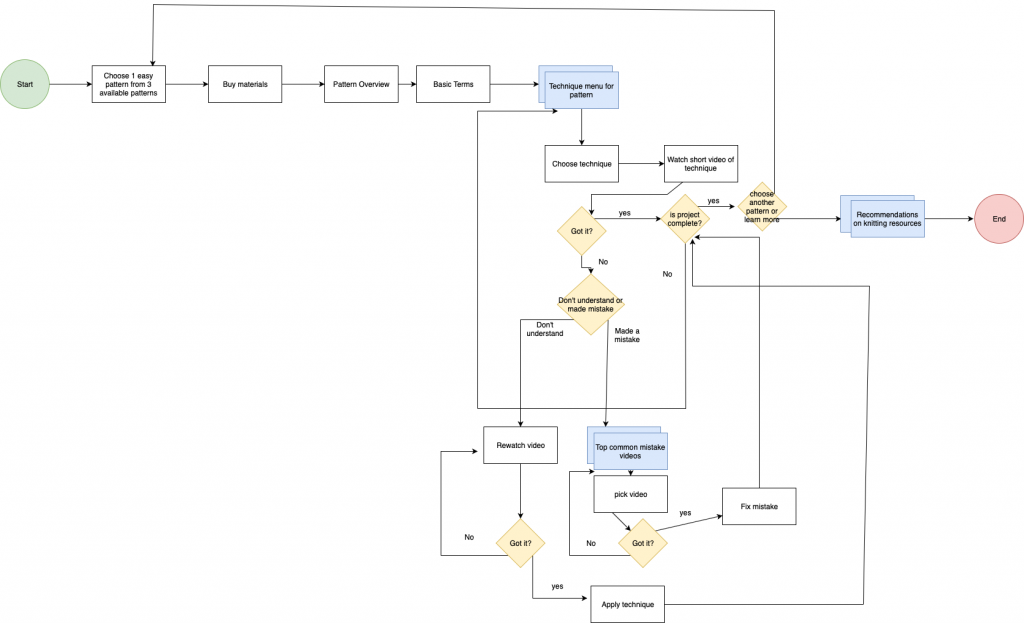
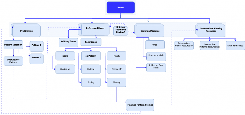
USER FLOW: SIMPLIFYING LEARNING
The research pointed me to focus on the way the targeted user learns and interacts with processing new information.
The revised user flow and broke learning down to the very basics:
IA: ENHANCING CLARITY
Card sorting revealed that original IA and categorization confused users.
The biggest takeaway came from realizing that there must be balance between teaching the correct knitting terminology and providing clarity for users who had never heard of the technical terms.
Users also struggled to differentiate beginner features from intermediate learning options.
Card Sorting + Revised Site Map: Better Terms
The card sorting exercise revealed that users were confused by the terminology – specifically those terms that were vague and not connected with clear actions.
ORIGINAL SITE MAP
|
REVISED SITE MAP
|
|---|---|
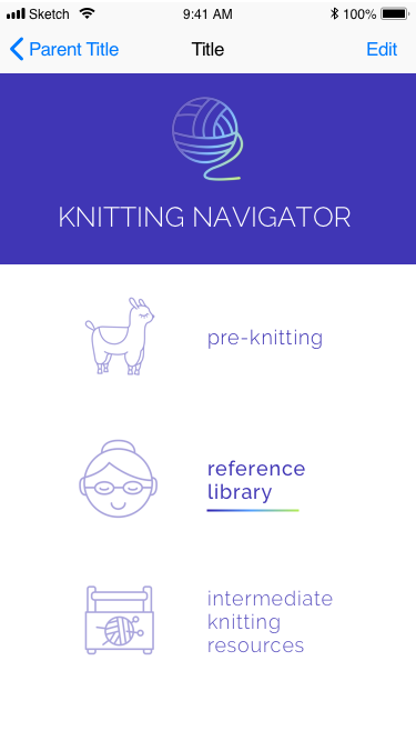
| Pre Knitting | Pre Knitting |
| Techniques | Pattern Overview |
| Troubleshooting | Knitting Library |
| Intermediate Resources | Intermediate Resources |
DESIGNING AN APPROACHABLE KNITTING EXPERIENCE
DESIGN / FEATURE PRIORITIZATION
Users wanted a way to learn how to knit focused on outcomes instead of process and learning beginning techniques.
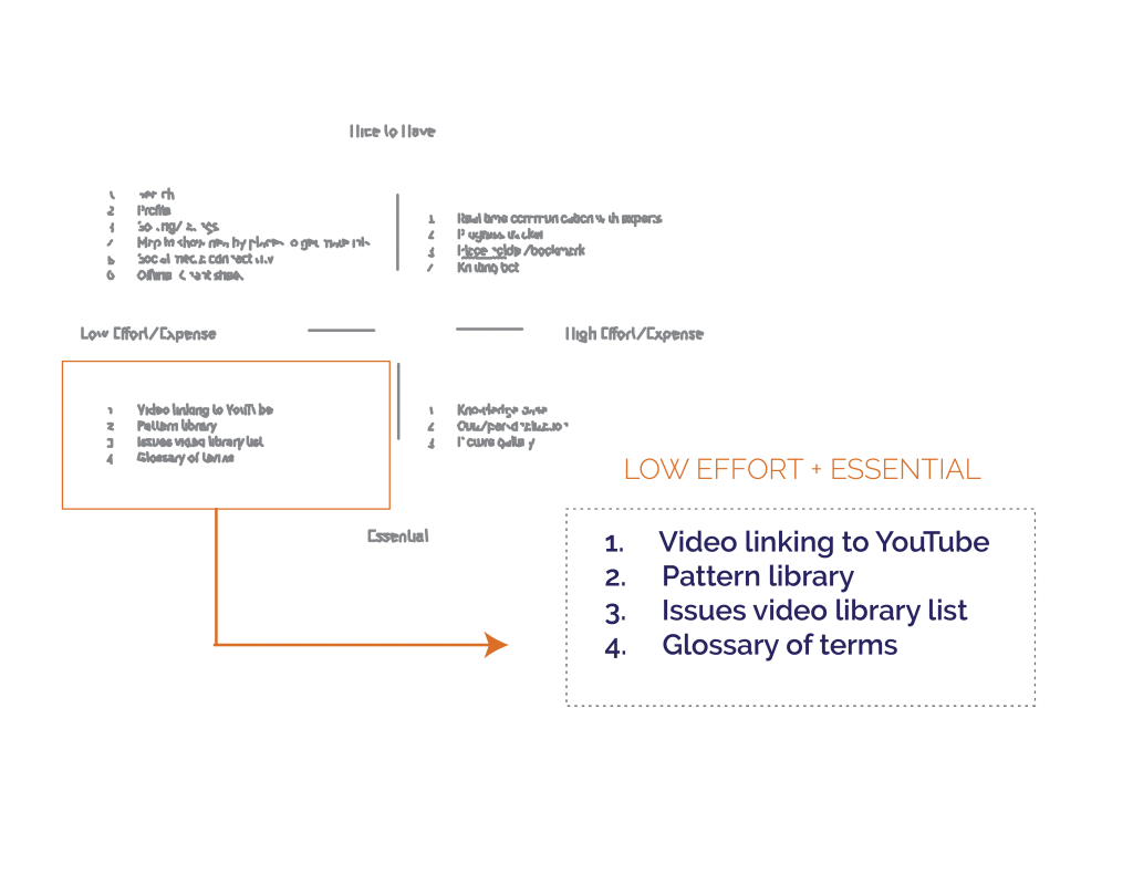
The MVP features in the prototype were directly linked to user needs – guiding them through their first project.
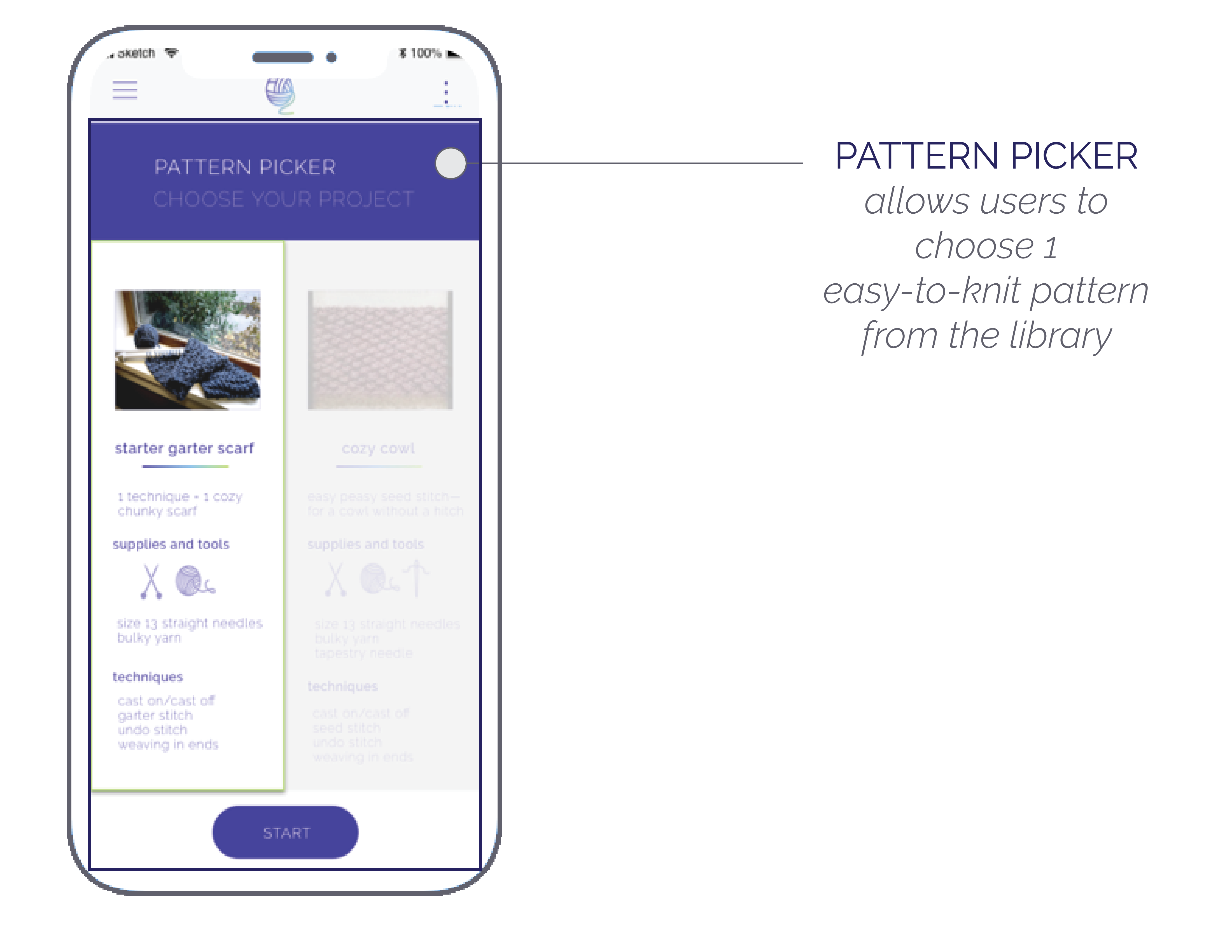
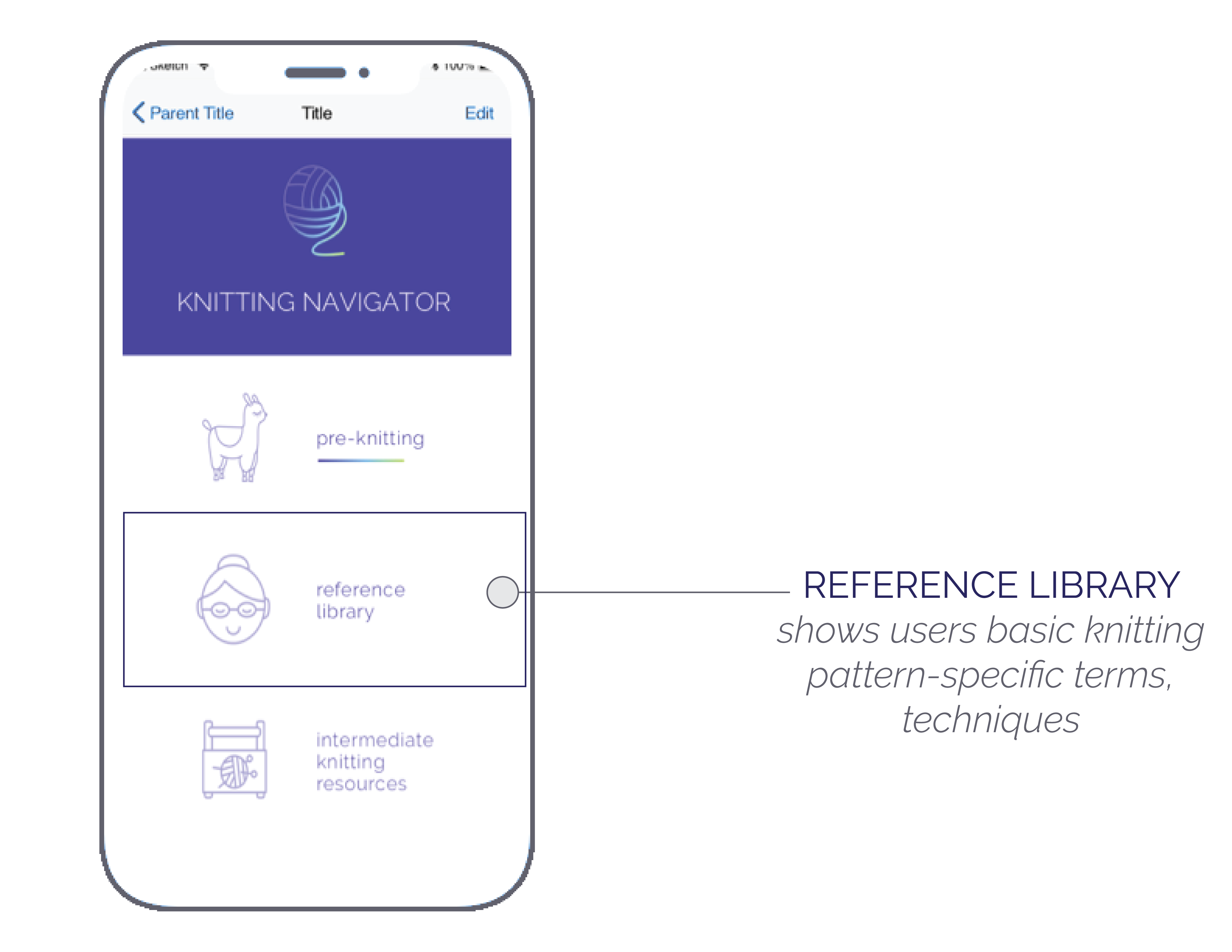
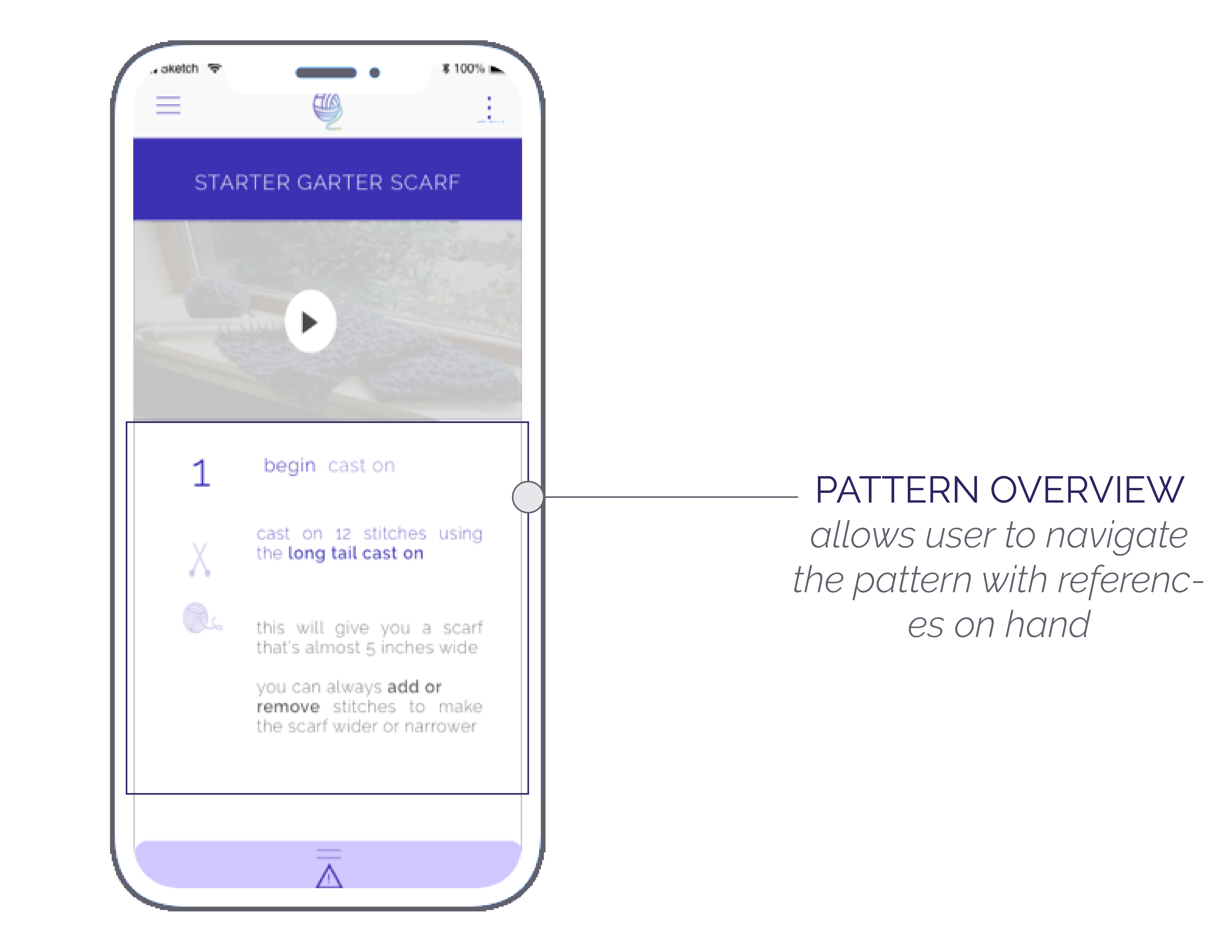
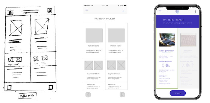
Design / Wireframes to Prototype
In order to make knitting more accessible to beginners I sought to make the design FRIENDLY, UPBEAT, and HELPFUL.
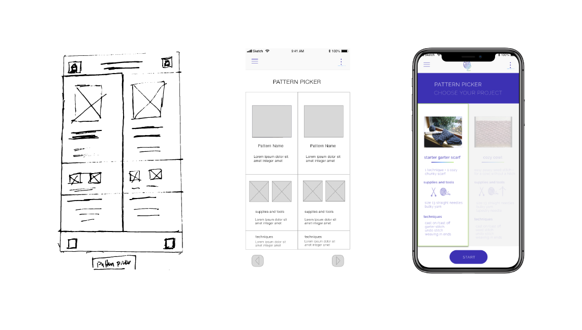
The final design incorporated access to references during the pattern knitting process and a reward for beginning knitters.
Testing / Lessons Learned
2 Usability Tests + 3 Tasks
MENU
DUPLICATIVE MENUS
INSIGHT / Options were duplicative and did not indicate that the references were pattern specific
CHANGE / Enhance workflow by streamlining menu options
UNNECESSARY MENUS
INSIGHT / Some menus were not necessary to achieve knitting goals (i.e. supplies and tools)
CHANGE / Streamline menus
MEANINGLESS NUMBERING
INSIGHT / Numbers in menu did not add value as they didn’t indicate order or priority
CHANGE / Adjust design and only use numbering to indicate order of items or ranking
INCONSISTENT GESTURES
INSIGHT / Use of buttons vs. swiping to move ahead throughout experience is not consistent
CHANGE / Make gestures consistent to enhance flow
‘UNDISCOVERABLE ‘ FEATURES
INSIGHT / Users did not discover in-pattern features (“navigator”) in app
CHANGE / Make pattern navigation priority – add onboarding screens with concrete references to features
ITERATION / PRIORITIZING PATTERN NAVIGATION AND ENHANCING USER FLOW
The usability tests revealed there was still more work to enhance the Knitting Navigator and to provide users with an easy way to learn to knit. While many of the changes are low effort (Menus and Gestures) the key insight was the need to ENHANCE DISOVERABILITY AND GUIDE USER TO NAVIGATING PATTERNS.
Going forward I will PRIORITIZE PATTERN NAVIGATION and study INSTRUCTIONAL DESIGN methods as well as “non disruptive navigation” experiences such as KINDLE to enhance user flow.
